

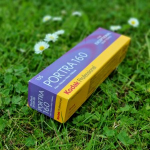
I’m going on record and saying “please be very careful if you’re planning on using Kodak Portra 160 for landscape photography” …
The last week has seen me simultaneously jumping with joy and cursing in frustration at the scans from two rolls of Portra 160 !
- The fine details are stunning 👍
- The dynamic range is amazing 👍
- Thematically the colour profile is beautiful 👍
- But … the colour casts that occur in extremes of light conditions are a major headache, in particular way too much yellow ! 😲😩
What really brought this message home was when I imported new Kodak Portra 160 scans into Adobe Lightroom, alongside some accompanying digital photos I happened to have taken at the same time.
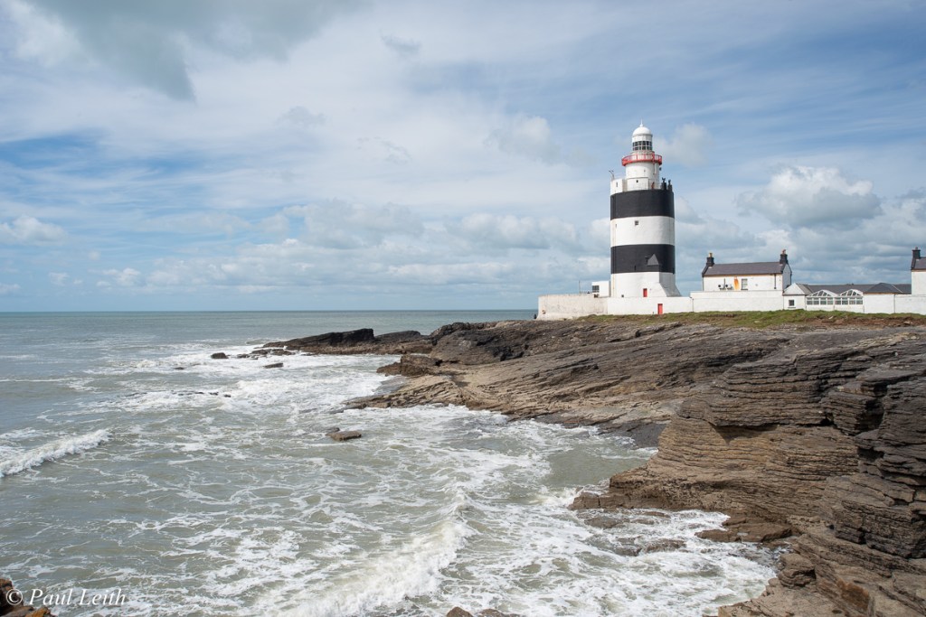
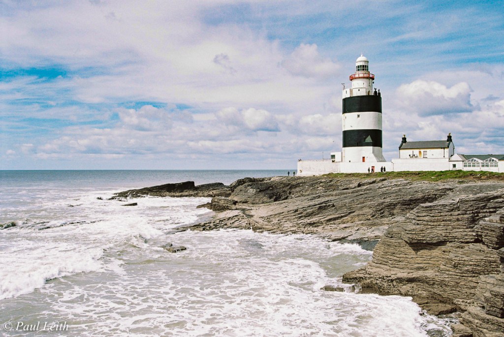
You can see that there’s a significant yellow-lime colour cast in the Porta 160 image, that’s occurred in bright, contrasty conditions at Hook lighthouse. I would normally chalk this down to white balance variations … but to my surprise, regular white balance tweaks didn’t solve the problem 😮 This never happened with my rolls of Kodak Portra 400 … this was something I wasn’t expecting 🤔
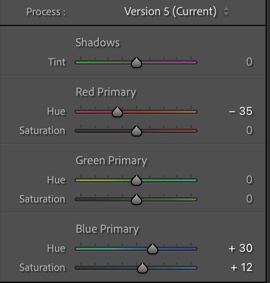
In order to get Portra 160 even close to the actual scene, which the digital image accurately recorded, I had to perform colour calibration adjustments in Lightroom:


You can see how I’ve had to push red’s into orange territory, and the blues into the green to help offset the yellow imbalance. To be clear, I was very mindful of staying true to film and preserving its own particular ‘look‘ – the task at hand was to correct colours which simply didn’t seem to be handled adequately at all for the scenes I was trying to capture.
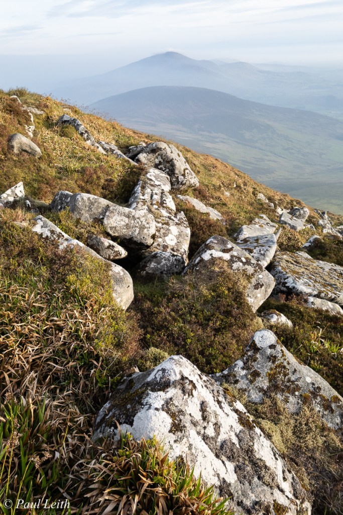
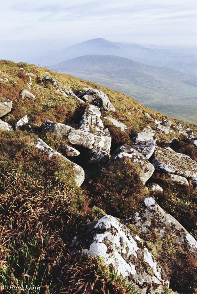
At this stage in the experimentation I was happily claiming victory, I had a useful preset created in Lightroom which I could reuse again and again … that was until I hit my next photo in the roll … dark, damp, overcast Irish skies … no, Portra 160 doesn’t like that light neither !
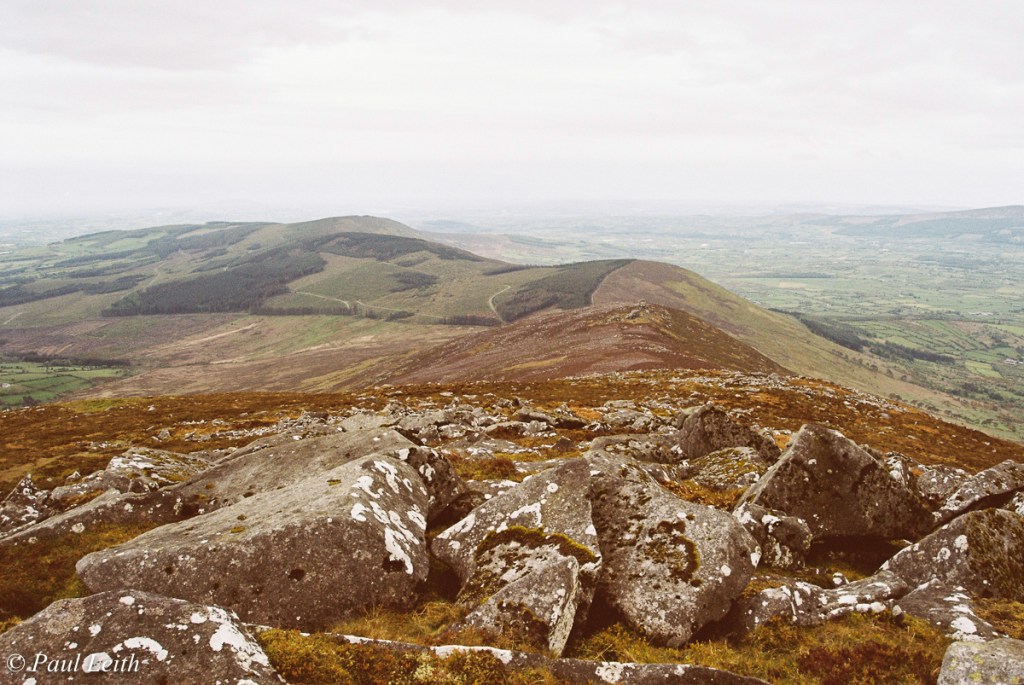
So while the bright sunlight caused a yellow cast to appear, the dark overcast conditions caused a strong yellow-orange cast … hmmm … more work required. This entailed also moving both the red & blue calibration sliders this time in the opposite direction:

This behaviour of Portra 160 was a big shock for me, and since 70% of my photography is landscape oriented, it’s a major ‘hassle-factor’ I need to consider when / if continuing to use the film.
Interestingly enough, I imported a roll of Kodak Gold 200 into Lightroom shortly afterwards, which contained a few overlapping shots, and everything just worked … no calibration required, just the occasional white balance tweak … how bizarre 😲
… and of course there’s moments of brilliance with Kodak Portra 160, as it worked beautifully well in this scenario, when you compare digital vs Kodak Gold vs Kodak Portra, unedited, side by side:
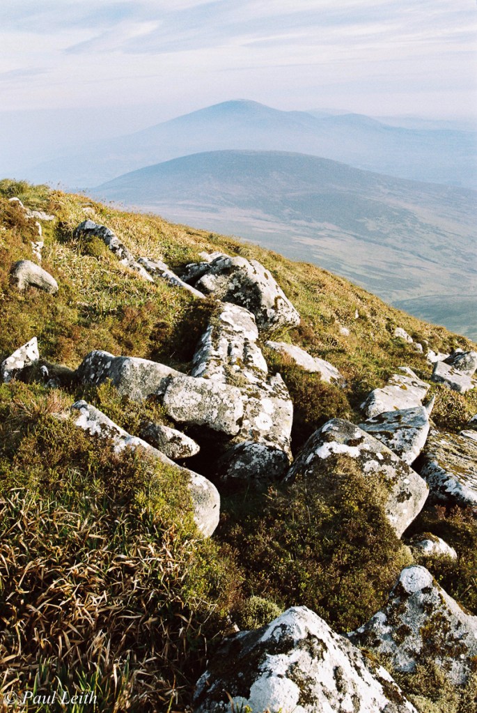
… how I happened to have 3 cameras on me, at the top of Mount Leinster was fortuitous in the extreme !🍀 However I hope that in sharing these experiences of mine, they may help you in your journey with 35mm film.
Until my next post, choose your film wisely ! Paul
💻 Instagram: @irishanalogadventures
