
After hitting a number of surprising bloopers with the first few rolls of film, it became very clear to me that getting to grips with center-weighted metering was going to be crucial to a satisfying & fulfilling film experience.
Even though it’s 2021, cameras still want everything to be exposed to medium grey … however, some of these older 35mm film cameras, just aren’t smart enough to allow for a bias on what’s being focused on, or whether there’s a bright sky above the horizon, etc.
So I want to delve deeper into center-weighted metering, the lessons I learned and a couple of hard-won, tips & tricks.
Choices : 1) meter as-is or 2) meter-and-recompose
The first thing I noticed was that I had a workflow / ergonomics decision to make when it came to getting accurate metering when out-and-about.
I was beginning to get myself very confused, a chicken-or-egg situation if you will: do I a) point my camera to something somewhere in the frame that approximates neutral grey and lock it in, or b) frame the image and figure out the exposure compensation as it stands.
I found that the answer somewhat depends on your camera, it’s features and how you use it, and here’s two situations I bumped into:
- Manual Mode – with my Nikon FT2, which offered manual mode only, it was easiest to point the center of the frame to something neutral, and adjust my aperature / shutter speed appropriately to zero the needle, and recompose
- Aperture Priority – my with Nikon FE2 & F80/N80, which offered aperature priority mode & an expsoure compensation dial, it was easiest to frame my shot, and then use my recently acquired knowledge of relative colour brightness to a set the exposure compensation
The secret ingredient : relative colour brightness
Despite figuring when & where to take my center-weighted meter reading, I was still making mistakes … for my last 15 years of photography, I NEVER fully appreciated how colour translates to exposure compensation … !
What do I mean by that exactly … ? Have a look at the following colours, I just passed a spot meter sensor over each of these squares, recording the recommended shutter speed for my ISO and aperture combination:

It’s quite remarkable … dark shadows are -1.5 stops darker, new green grass is +0.5 stops brighter, blue skies are +1 stop brighter, and bright white can be up to +2 stops brighter, etc.
I’ve only ever read this explained in terms of shades of grey … never colours !!
In fact, if it wasn’t for me revisiting 35mm film photography, this seemingly ‘fundamental’ information would have continued to allude me … and I would have carried on being hopelessly dependant on matrix/evaluative metering … which is still easily fooled, even in 2021 … and forever ‘chimping’ and checking my histogram 😦
So here’s a helpful relative colour brightness table I created over the last year, with helpful examples:
| Colour Ref | Helpful Examples | What To Do |
 | 1. Sunsets 2. Bodies of water (lakes, rivers, etc.) 3. Dark moody skies 4. Deep forest trees 5. Brown & purple heath (Wicklow mountains) 5. Deep blue of the high sky 7. Shadows (e.g. dark side of buildings & under bridges) 8. Dark objects | Set your exposure to be 0.5 to 1 stop darker. … With film you don’t really want anything more than -1, as film loves light … |
| Coloured skin (portrait) | Set your exposure to be 0.33 to 0.5 stop darker | |
 | 1. Grass & new leaves 2. Light concrete & footpaths 3. The colour red & dark orange 4. Medium-blue middle sky | This is ‘normal‘ exposure – you’re good to go 👍 |
| Caucasian skin (portrait) | Set your exposure to be 0.33 to 0.5 stop brighter | |
 | 1. Fluffy clouds 2. Light-blue skies (close to the sun’s position) 3. Light coloured flowers 4. Gold & silver | Set your exposure to be 0.5 to 1 stop brighter |
| Frost / snow and white objects | Set your exposure to be 1 to 1.5 stop brighter |
When I framed my photos, I began a new habit, to scan what was predominantly in the center of my frame, and confidently override the exposure which my camera ‘thought’ was correct !
Examples from the field
I want to show a few examples of how this worked for real:
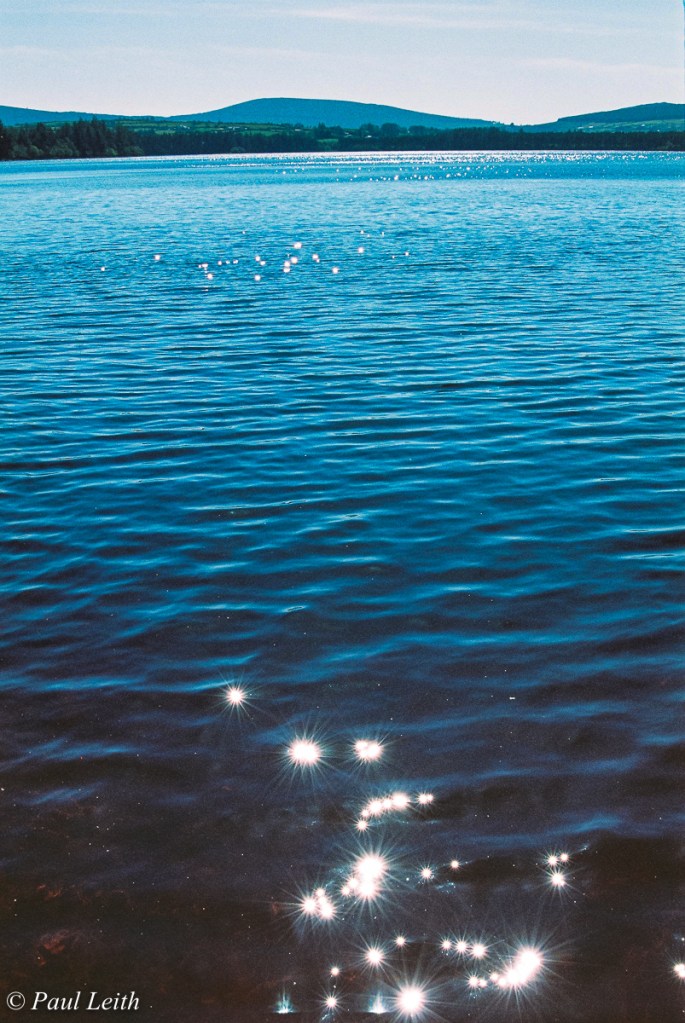
A) Down by the lake …
In this situation, the lake is taking up a considerable portion of the center frame, so I set my camera to be half a stop darker.
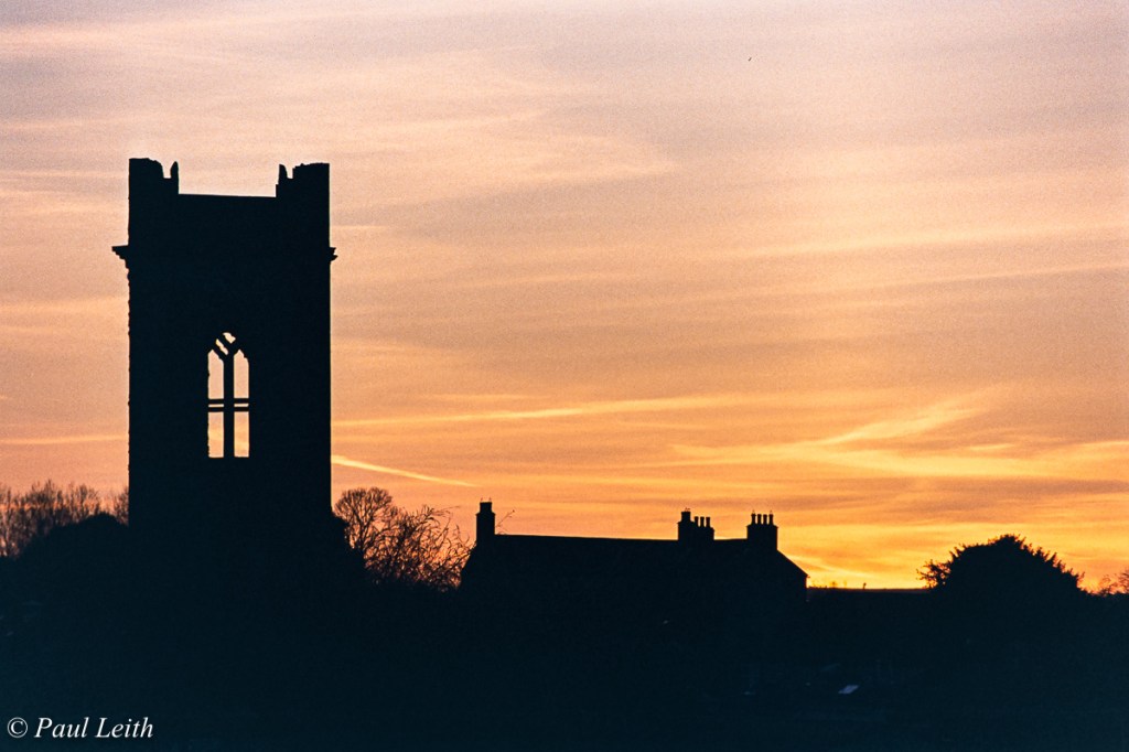
B) Blazing sunset …
This is a scenario, that I kept struggling with time and again, until I finally realised that it was actually easy … I was looking at dark red, dark orange, dark purple … so set my camera to 1 stop darker.
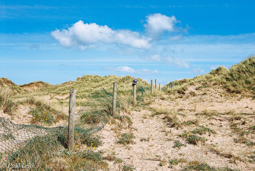
C) Beautiful sunny day …
Now that I was appreciating colour as it related to medium grey, those bright blue and/or fluffy cloud landscapes became simple … set my camera to half a stop brighter
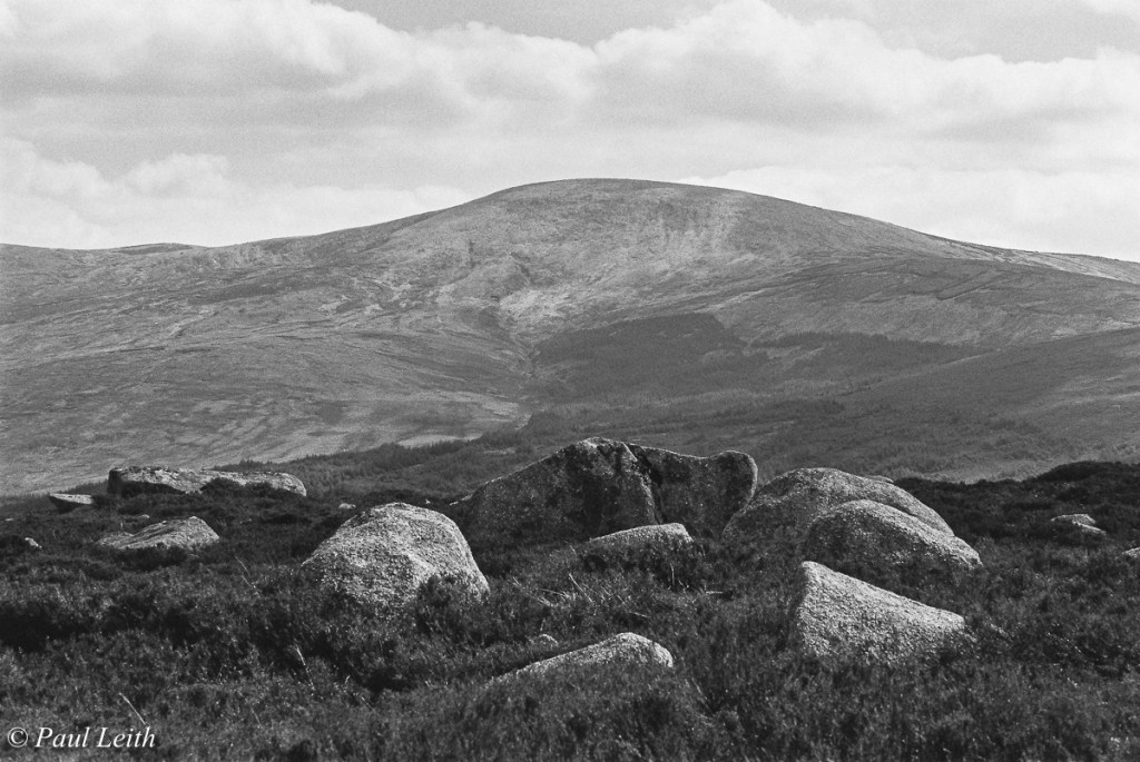
D) Mountain landscape …
In this case, I was automatically realising the dry brown heather of the Wicklow Mountains was fooling my camera … so set my camera to half a stop darker
I hope that sharing these learnings help, as I truly believe that once I became confident in overriding the simple middle-grey approach of my film cameras, I was getting more ‘keepers’ in my photo collection.
Until my next blog post, Paul !
💻 Instagram: @irishanalogadventures
